Explainable AI (XAI): Core Ideas, Techniques, and Solutions
Looking for new ideas I have found an interesting ACM Journal, CSUR ACM Computing Surveys, which publishes surveys helpful to get introduced to new subjects; a place to have a look at from times to time. Browsing the latest issue I have found this article:
Rudresh Dwivedi, Devam Dave, Het Naik, Smiti Singhal, Rana Omer, Pankesh Patel, Bin Qian, Zhenyu Wen,
Tejal Shah, Graham Morgan, and Rajiv Ranjan. 2023. Explainable AI (XAI): Core Ideas, Techniques, and Solutions.
ACM Comput. Surv. 55, 9, Article 194 (January 2023), 33 pages.
https://doi.org/10.1145/3561048
It’s quite long, 30 pages, and it describes many techniques and tools useful to understand ML models; for instance LIME and SHAP graphs are explained, with some examples, and this will help me better understanding many other papers.
XAI is helpful in two contexts: when you are developing a model it will help you understanding if it is precise enough and if it can be used as intended, when the model is deployed, XAI will help you explaining why a decision has been taken. The understanding consists in identifying the most important features, theirs relations, the presence of bias in the training data etc.
There are many XAI techniques, they can be divided in many ways. You have model agnostic and model specific techniques, if they target or not a specific model. You have global interpretation or local interpretation depending if the technique tries to explain in general what the model is doing, or it is limited to explain why a decision has been taken for a specific input.
The paper has many sections, the ones I liked the most are “Feature Importance” and “Example-Based Techniques”, but there are other sections about tools for model explainability (Arize AI, AIF360, AIX360, InterpretML, Amazon SageMaker, and Fairlearn) and distributed learning.
To understand features, you can use the Permutation importance technique: it is computational expensive but it’s output is a nice table with a number for each feature, the higher the value the more important the feature is. You have also PDP Partial Dependence Plots, whose output is a graph. On the x-axis one feature, and a line with the predicted value, around the line a confidence area. This technique analyzes a feature at the time, and does not take into account correlations.

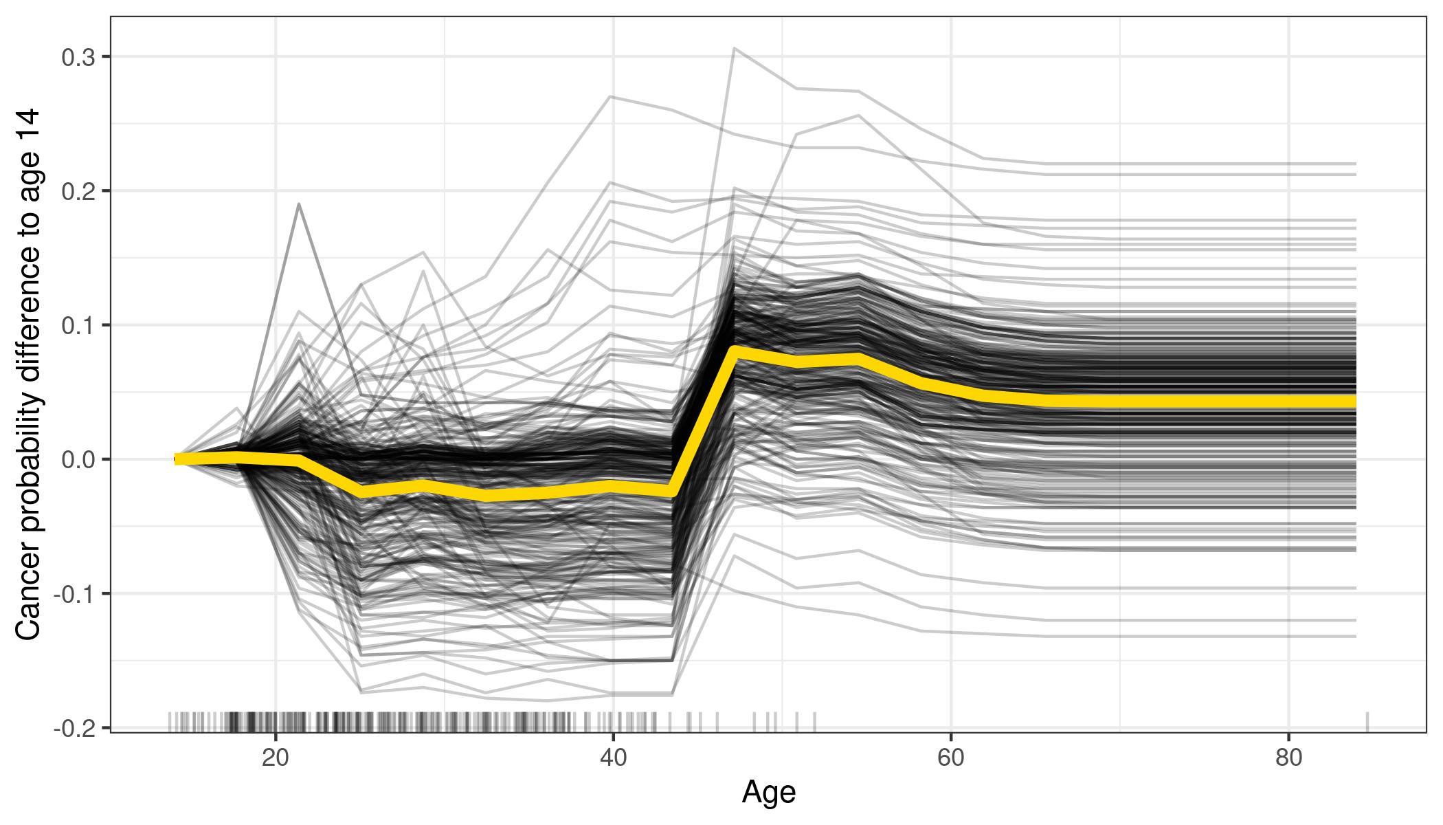
ICE Individual Conditional Expectation plots are very similar to PDP, instead of seeing a gray area around the line, you will see many lines showing what is happening for various instances. Of course if you plot too many instances you will have something difficult or impossible to read, but it is more easier that interpret than the gray area in PDPs.
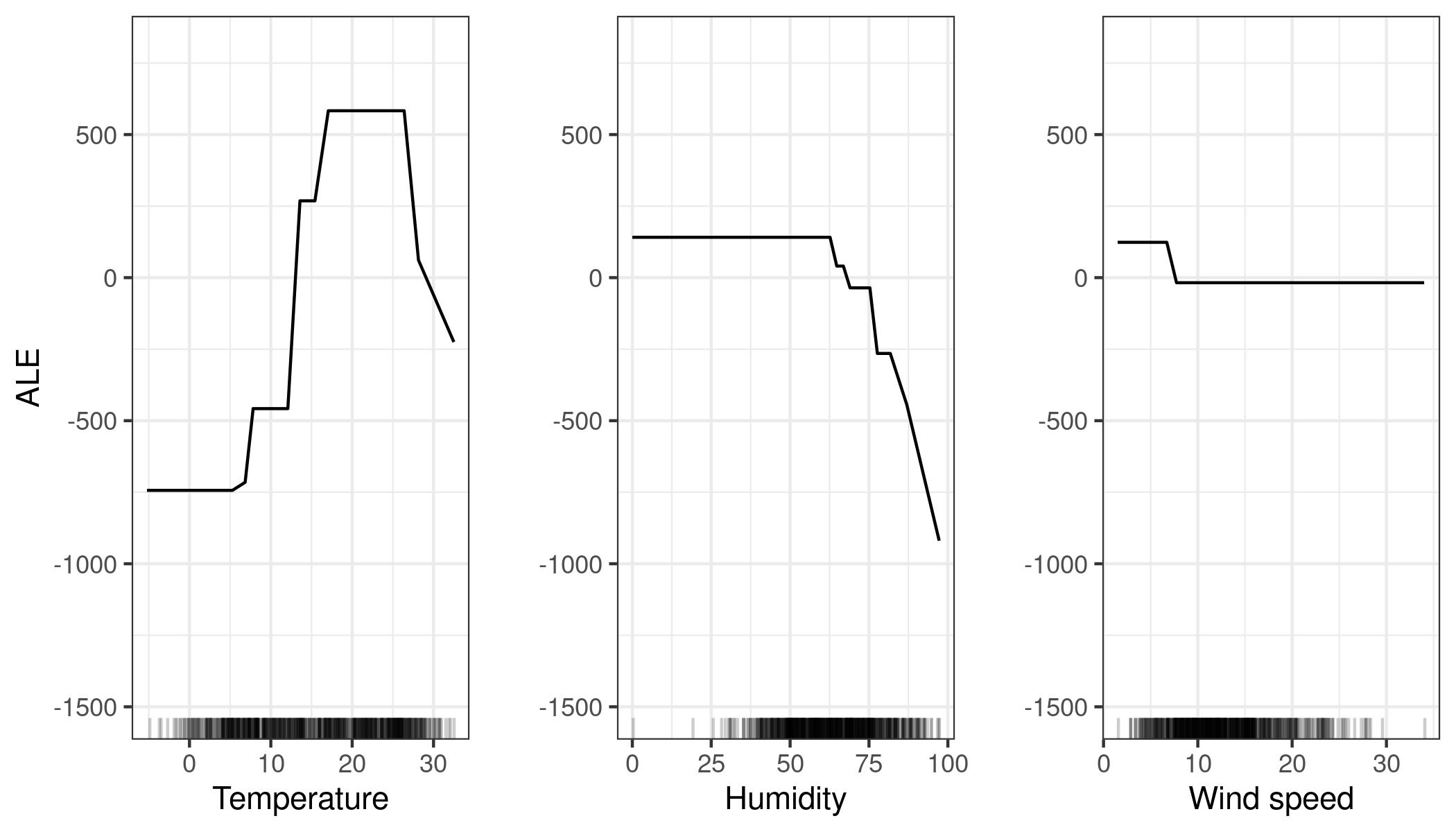
ALE Accumulated Local Effects are another way to visualize features importance: the authors do not explain much about them, they just say that the work also well if features are correlated. Below you see an example about bike rentals, it is easy to understand when a feature becomes important: when is raining (high humidity) people do not want to rent a bike.
Moving to local interpretation, you have the LIME Local Interpretable Model-Agnostic Explanations technique: a sample input is perturbed and the impact on the prediction is captured. With images it is really easy to understand which elements the model is taking into account to make a prediction
Lime can work in other contexts than images, showing which feature values are increasing (or decreasing) the prediction

Another great tool to visualize feature importance is SHAP:

Here features are sorted by theirs impact, Feature 1 has more impact than Feature 0. When the bar is red painted, that value will make the prediction increase, when it is blue it will make the prediction decrease. Shap output can also be represented in this way:
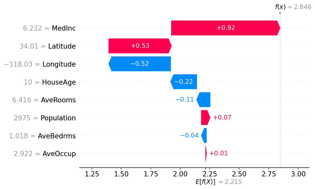
Here you see how each feature has contributed to the final result, starting from the average model prediction. AveOccup and AveBedrms have nearly no impact, Populations contributes to the house price a bit more, AveRooms decrease it, etc until MedInc that contributed the most, and the final prediction is 2.846. Each observation will have its own SHAP diagram.
Another interesting question you can ask is “what is the minimum change of a feature that can make the model prediction change?” An interesting question for a classifier model. These are called Counterfactual Explanations, usually presented in tables that shows the features values compared to the original sample.
This paper presents a plethora of useful techniques, and references many tools to apply them: it is definitively a good bookmark to add to your browser.

Leave a comment