Receiver Operating Characteristic (ROC) curve
Reading some papers I frequently see these kinds of graphs. Since it’s long time I completed my studies, I have forgotten how to use them, and I need a refresh. Here you see one ROC curve taken from Machine Learning-based Short-term Rainfall Prediction from Sky Data. https://doi.org/10.1145/3502731

As usual, a quick look at wikipedia always helps: https://en.wikipedia.org/wiki/Receiver_operating_characteristic. There is a long list of indicator and a long discussion about other ways of selecting a model, a bit too compliaced to digest during a Saturday morning, but here are the key points.
Main assumption: you machine learning model answers a binary question, is there a dog in the picture, or will it rain in 30 minutes. In this context you will have a test set where you have input values and the correct classification label: int this picture there is a dog, in this one no (don’t care if there is a parrot).
I assume that, if your model need to classify pictures betwee dog, cats and parrots, you can end up having one ROC diagram for each class: this picture contains a dog, vs this picture contains a cat or a parrot.
I am pretty sure that, if you have many more classes, you end up with too many curves and this method is not useful anymore.
But to come back to the binary question, you have 4 possible situation for each sample
- the answer is yes and the ML model has found yes: True Positive (TP)
- the answer is no and the ML model has found yes: False Positive (FP)
- the answer is yes and the ML model has found no: False Negative (FN)
- the answer is no and the ML model has found no: True Negative (TN)
This makes things simple to understand, but for me it hides a par of the reasoning: usually ML models depends on parameters, for instance a threshold ML(x,y,z…) so the answer the model can give is a function of these parameters. So TP, FP… are actually TP(x,y,z..), FP(x,y,z..)…
So if you have only one parameter, say t for threshold, you have TP(t), FP(t), etc. As usual you can decide to plot these curves and try to guess the better threshold.
The ROC method tells you to plot together on a cartesian plan these 2 functions
FPR(t) = FP(t)/(FP(t)+TN(t)) fall-out or false positive rate
TPR(t) = TP(t)/(TP(t)+FN(t)) sensitivity, recall, hit-rate or true positive rate
So there are too many names for the same functions, this complicates the things when you read an article.
My conclusion is, if you have many parameters, that you just have to plot on the diagram a family of functions, and then chose the better parameters value to use it in your classification problem. But how do you choose them?
Check this picture on wikipedia: https://en.wikipedia.org/wiki/Receiver_operating_characteristic#/media/File:Roc_curve.svg
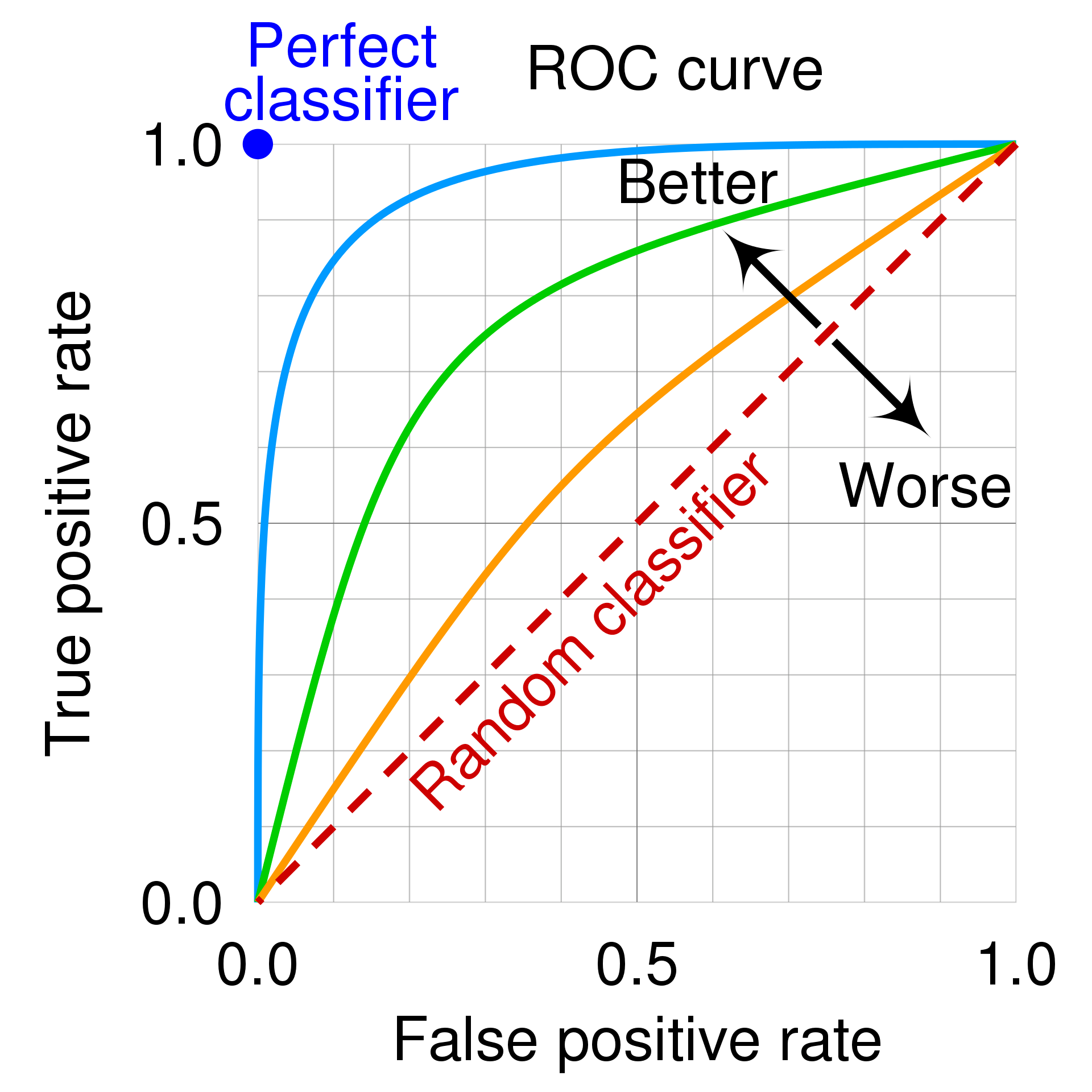
So the upper left corner is the perfect classfier, that is one that has true positive rate of 1: all yes prediction match perfectly the test data, and it has no false positive at all.
My guess is then that you just have to pick the point on your ROC curve that is more close to it and use those parameters.
In the pages I have seen it is always said that the diagonal is the response of a binary random variable: if your ROC curve is close to it, your model is as powerful as flipping one coin and say yes when you see the head, just useless. Also if your model is very bad, just replace yes with now, and you will have a better model (a test that always find that you don’t have covid, and never makes false predictions, would be indeed useful if you want to know if you have the covid).
So what was bothering me of many ROC curves plotted, like the one at the beginning of the page, is that there are no parameter values on the line, and this made me not understand how to actually use them.

Leave a comment